Redrawing Pages – Strange High House in the Mist

I’ve scanned all the pages of Dream-Quest and am working on getting the book into shape. I’m making some little tweaks to the old artwork, and a few pages have been particularly messy, with crumbling whiteout, liquefied screentone and other disasters that can happen to Bristol Board pages stored in a box for 10 years. (Actually, they were in nice light-blocking photo-sleeves, but…)
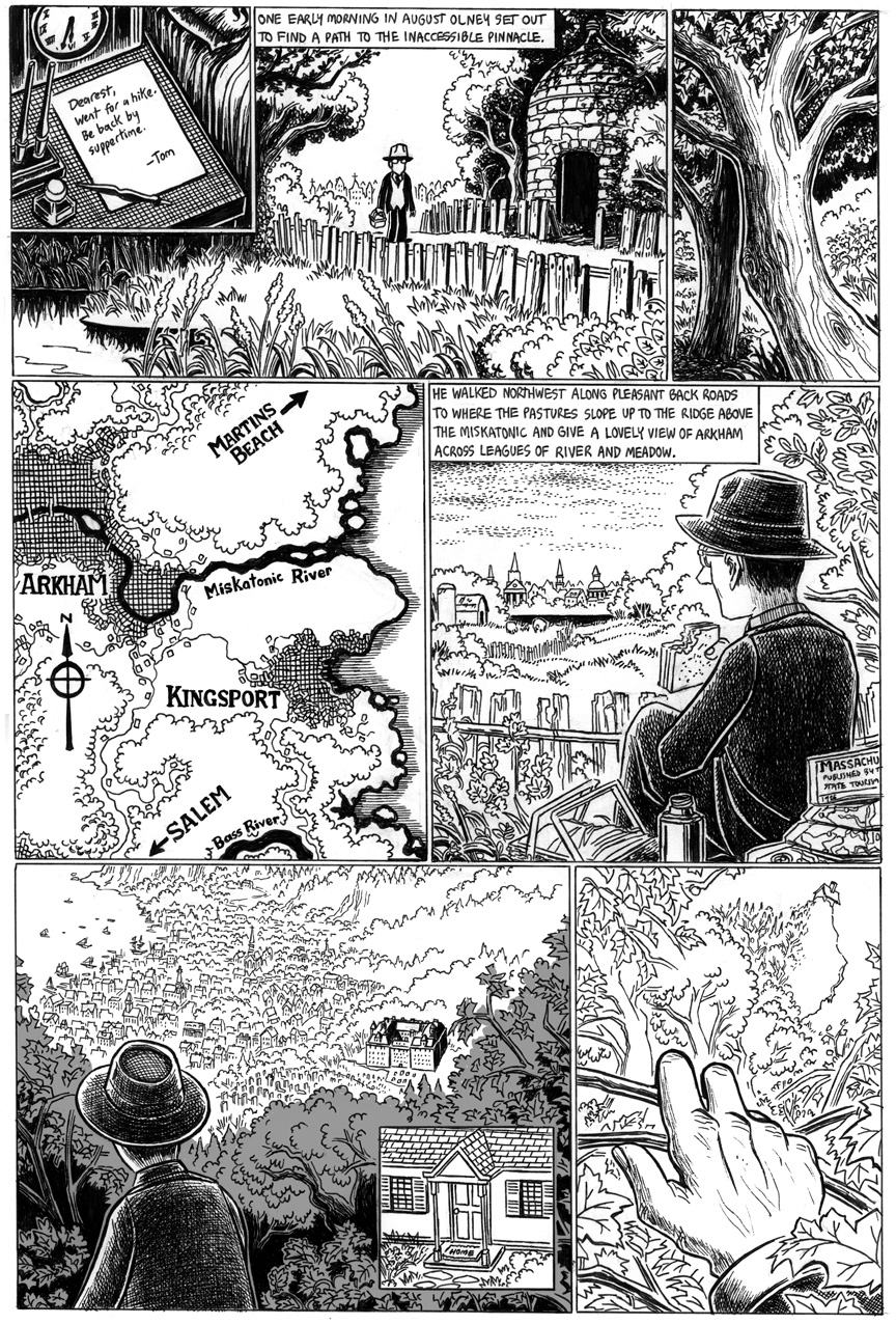
I lost all the pages to “The White Ship” and most of the pages of “The Strange High House in the Mist,” but I had most of them in digital format, so it wasn’t a problem. However, there was one page of “Strange High House” I only had in low-res and so had to completely redraw. The original version is here, but the new version is the one that’ll be going into the graphic novel. Click on the image for a bigger version!
Pretty good redrawing! I had to do a double-take to notice that they were in fact different. Interesting choice to have him take a picnic in the 4th panel instead of the more active reading a map and walking… I guess it’s a good idea to show him actually finding a use for the picnic basket that he carries along. :)
A possible critique is that the inclusion of the front door close-up in the 2nd-to-last panel doesn’t make any sense if the location of what he’s looking at isn’t highlighted as it is in the original version. It’s harder for the reader to figure it out, in any case.
Good point about the house… maybe I’ll try to add some more focus there, but I didn’t like the way the original panel was so drowned in screentone. I took the opportunity to add more detail to the map, and I had him sitting down, yes, to give him something to do with the picnic basket. ;)
Maybe you could have the screentone a lighter shade, or have it gradually fade to white as it gets farther from his house?
It may be just a case of choosing the lesser evil. If it’s a choice between making the fine line-work of the town slightly more visible and making it clear to the reader what’s going on, I think the choice is pretty clear…