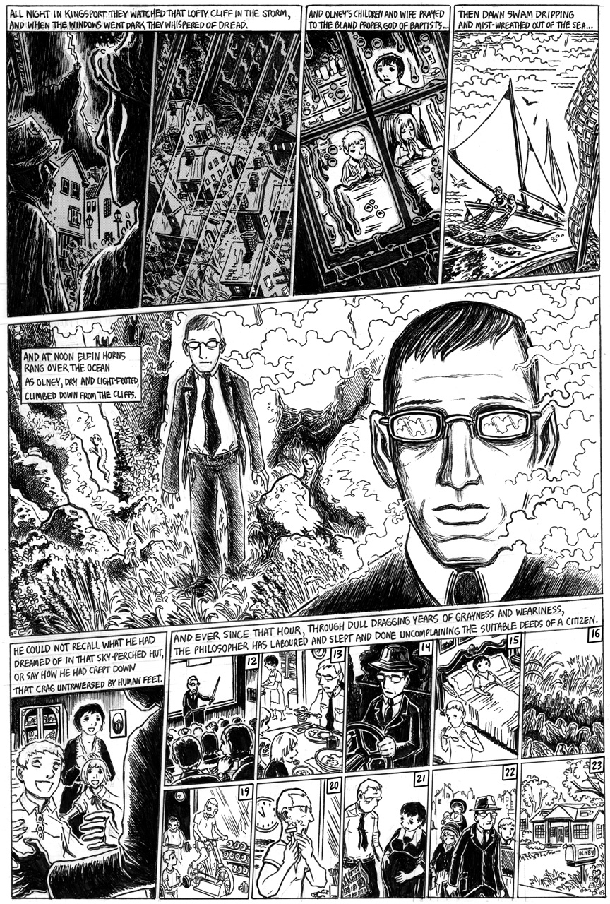
The Strange High House in the Mist, Page 14
Just two more pages to go! As they say, LET’S DO THIS!
In the intervening week I’ve been working on a couple of other things, including some writing and on some T-shirt designs (which you can see here if you’re on facebook). Hope I’ll see you all next Friday for the next page!
NEXT UPDATE: January 14

Continuing awesomeness!
The highlighting on the men’s faces in panel one is very effective! In fact, you’ve put more in that one narrow panel than I would have believed possible–and yet, it doesn’t appear crowded. One of the best things about your drawing style is that although it is replete with wonderful details, it never appears cluttered or difficult to read. You always put the primary focus on what is most important in the panel, and leave the knick-knacks to be discovered in a subsequent reading. Case in point: upon his reappearance in panel five, Thomas Olney appears almost insubstantial, as if he were stepping out of a dream (which, considering his experience in the previous page, is quite understandable). It wasn’t until I read this page a second time that I noticed all the little creatures surrounding him!
Yes, there is a lot to like in this one.
I love panels 1, 2 and 4 especially.
In the 5th one, is it just me or do his legs and arms look a bit wiggly? Looks half-unreal…
Thanks for the kind words! Olney looks maybe just a bit too cartoony in the middle panel — in addition to the loose arms and legs, his head is a little big. Most of that is just my style, though, although some of the other weirdness is intentional. I’m working now on page 16.
If I’m not mistaken, you used Lovecraft himself as the model for Olney.. nice ;)
@Ethan – Heh heh heh… There’s a lot of Lovecraft look-alikes when I draw comics based on Lovecraft stories! ;)