Dream-Quest Cover Sketches
I’ve been planning to do a Dream-Quest graphic novel for some time, and I did a few different cover treatments before coming up with the final version.
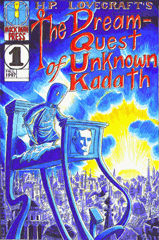
The original cover for issue #1 of the comic series, which I drew waaaay back in 1997, wasn’t great, but it was one of the better covers of the original five-issue series because I was smart enough to use a limited color palette. Color was still not my thing, though. I tried to duplicate the same “sunset sky” (although doesn’t it look more like dawn?) limited color palette, with better lineart, for the first version of the cover:
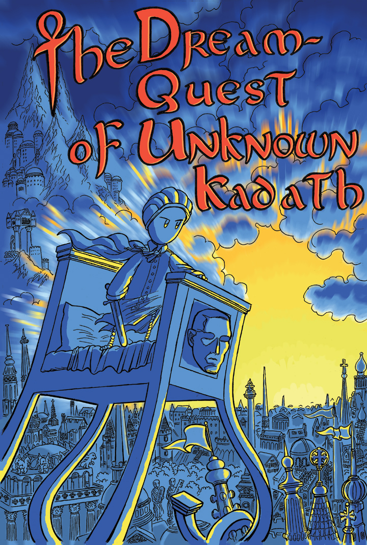
But, as time passed I decided I didn’t like this design anymore. It was too simple, the Photoshoppy colors needed work, and the massive, cover-dominating logo looked bad. In 2011, when the Kickstarter got going, I decided I wanted to do a wrap-around cover instead!

Aside from the sunset city, there were two other images that screamed “Dream-Quest” to me: the actual castle of Kadath (but that’s kind of a spoiler) and the scene when the black galley goes off the edge of the world. The black galley scene was used as the cover of Edward Martin III’s Dream-Quest movie, after all. I considered an epic shot of galleys plunging off the edge of the world into space, crewed by — cats? Randolph Carter? Evil merchants? Ghouls? Possibly Basil Elton, Kuranes and the other dream-story protagonists?
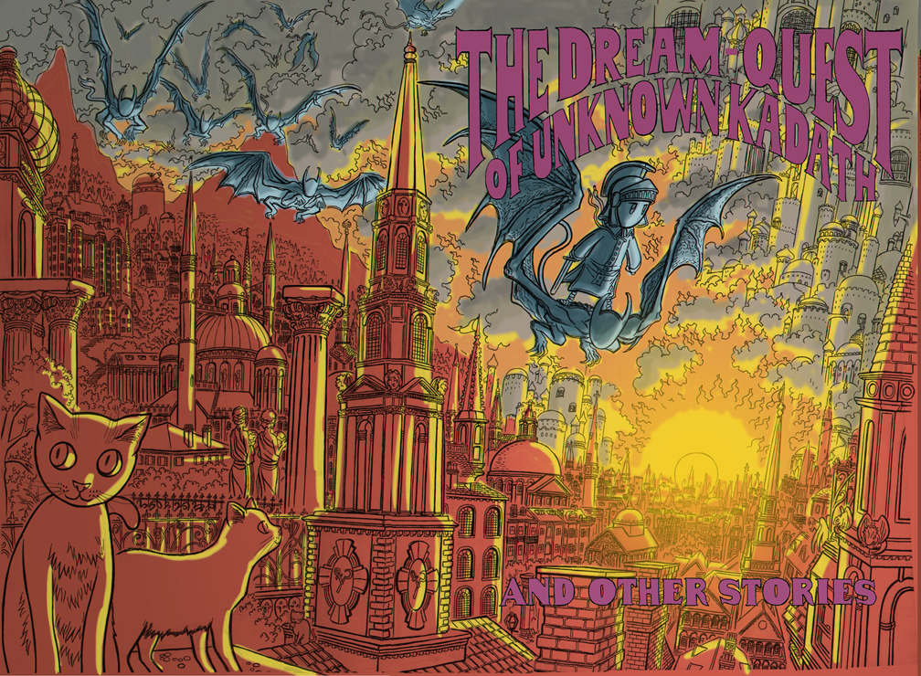
A sailing ship with all its sails and ropes would have been a great image for the front cover, and would have really given off a feeling of adventure. But in the end I decided that a bunch of ships crewed with different Lovecraft characters would suggest that the graphic novel was some kind of Lovecraft mash-up instead of an anthology, and I went with the sunset city, for a more whimsical, children’s-booky look. (With the addition of a nightgaunt steed to replace the Little-Nemo-in-Slumberland walking bed of the original comics front cover.) My first draft had a fiery, apocalyptic Photoshopped look — “through sunset’s gate He swept me, past the lapping lakes of flame, And red-gold thrones of gods without a name” — but eventually, I decided on more natural, subdued colors. The actual final color covers were done entirely by Jay, who spent hours and hours on the Cintiq working with her brush pen. All the intricate, loving detail on all the grassy cobbles and red roofs are all hers. Although I love black and white, I hope to do more color work of my own someday soon…
Discussion (2) ¬
The ships would’ve looked really nice, as well. I think I really prefer the font on the bottom version of the title page here, rather than the simple white text that was eventually used. Especially if the letters were coloured in to look ornate and three-dimensional (as if they were brass letters on a door, or something) , it would’ve looked fantastic.
Well, it still looks all right – the book itself is so high-quality that even the simple text looks impressive. Everyone I’ve shown it too has been really amazed by it.