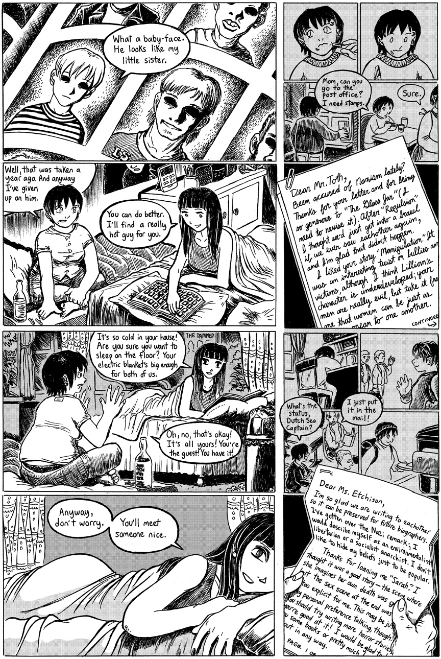
The Stiff: Chapter 2: Page 47
I’m spending most of this week putting together my panels for Kumoricon next weekend. Predominant among them is my panel on “Manga Hell,” an expansion of a PULP article I wrote around 2001, in which I talk about THE WORST MANGA EVER. In the intervening 12 years, there’s been so many new, delicious examples of terrible manga, it’s difficult to cram them all in there. But I’m doing my best! I hope you can make it to the convention and check it out!
A brief note about the gray colors in “The Stiff”: at this time, I was using a technique (if you can call it that) when I would attempt to exactly imitate the look of physical screentone in Photoshop, by creating files that were nothing but thousands of tiny dots and pasting them over the artwork in a separate layer. (In some cases, I scanned actual screentone; in other cases, I used Photoshop’s screentone bitmap-conversion feature. At least I wasn’t drawing them by hand…) That’s the reason for the slightly pixellated, moire-pattern look whenever there’s gray in the picture. It looks good in print, but not quite as good on a computer screen; however it’d take much too long to go back and reconvert them.
NEXT UPDATE: Monday!

Discussion ¬